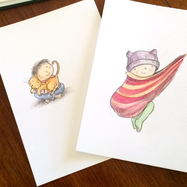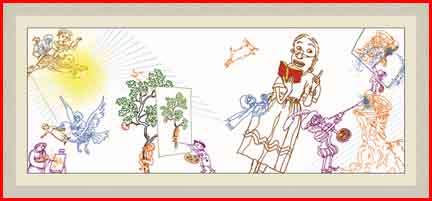
Art Director of Walker Books, Sarah Davis, shared her wisdom in a very captivating way. Not only an amazing artist but a true storyteller (check out Sarah’s amazing art, here.) Sarah shared the key things an Art Director is looking for in a meaningful way, particularly for those of us who are still not sure of the difference between an illustrator and an artist. The answer?
“AN ILLUSTRATOR IS AN ARTIST WHO FOCUSES ON STORY TELLING”

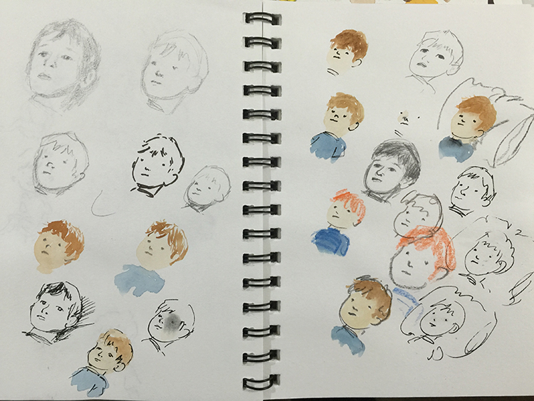
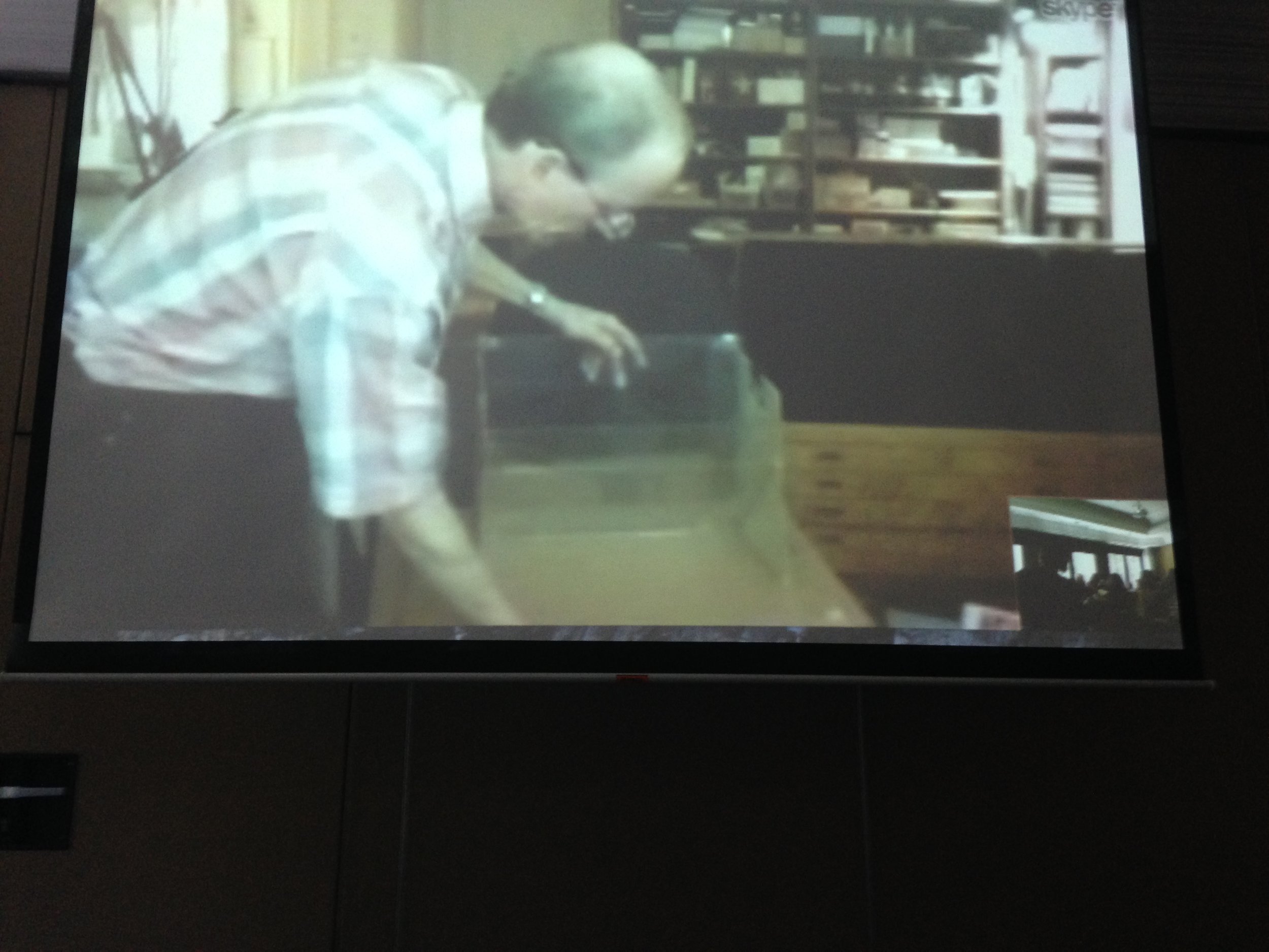
Art Director Sarah Davis’ break out session for illustrators
What is an Art Director looking for?
Illustrators who are talented, professional and have the x-factor.
Sarah’s 7 key topics:
1 - TECHNICAL SKILLS
Become confident in your use of technique and mediums.
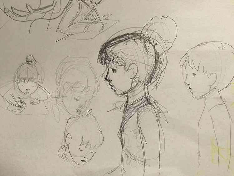
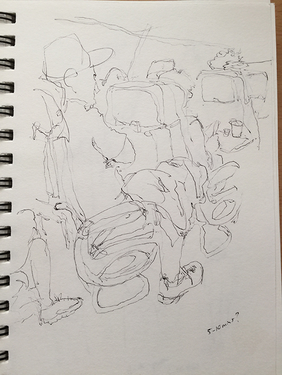
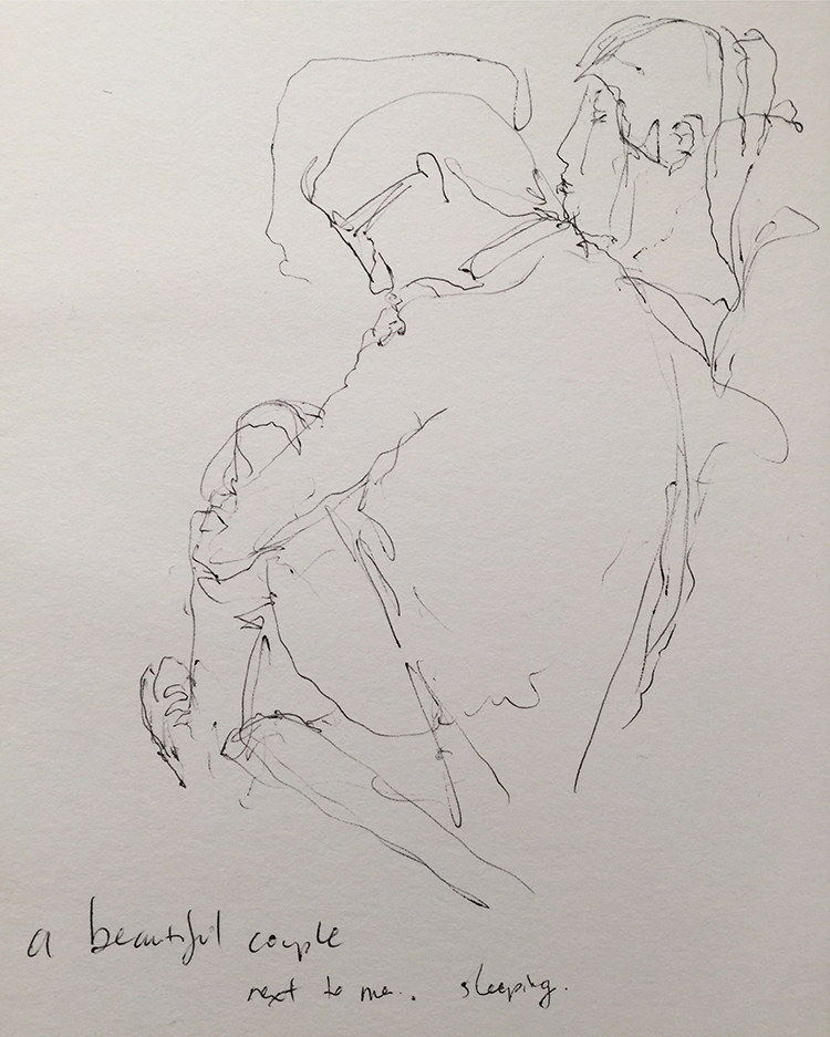
You need to be able to draw - observational, expressive
Understand the formal elements of art - light, tone, form, structure, mark-making etc.
Remember a beautiful artwork is not the same as a successful illustration.
Ask, how can I develop my Technical skills?
Lots of learning and doing
Lots of observational drawing
Take classes
Experiment with different media
Research other artists work. What works? What do you like? What don’t you like?
2 - FEELING TOWARDS THE CHARACTER
Can you help the reader connect and empathise with the characters?
Can you show mood or emotion?
Do your poses show expression?
Show interaction between characters - establishing clear relationships
Interesting personalities
Character consistency
How can I become better at creating a feeling towards the characters?
Lots of practice.
Observe and collect - draw lots of people in your life and around you
Learn from yourself - pose!
Be prepared to draw and redraw and redraw until you know your characters - once is not enough
3 - NARRATIVE
Remember you must tell a good story, that has clarity and continuity
Can you create emotional punch?
Can you make the reader curious - What just happened? What might happen next? What’s at stake?
4 - RESEARCH THE MARKET
Make sure your work is appropriate for the genre, age group and publisher you are submitting to
Look at your competition. What makes you special/different/better?
Visit libraries, bookshops, publisher’s websites. Take note of the publisher on the imprint pages of books you love. Who is a good fit for your style?
Look at other artists on the internet eg: Behance, Pinterest, Instagram and look at the hashtags that they use. Try #australianillustrator and many others
5 - INTERESTING VOICE
Does your work have an energy, ideas, freshness?
Do you have an interesting use of media?
Maybe you show unusual concepts?
Is it expressive?
How can I create my own interesting voice?
Sometimes finding your voice can be tricky. Before we become lost in how to make art, focus on storytelling first - can you tell a good visual story?
Then work out what your other passion is and improve your skills in that area… eg:
Line and form?
Light?
Colour?
Pattern?
Media?
Character?
Setting?
6 - BE NICE
Same as any other profession.
Can you deliver on time and to specifications?
Can you follow a brief?
Be professional and collaborative. Open and dependable and flexible.
7 - HAVE A KILLER PORTFOLIO
Only show your strongest work
Does it show the above 6 topics? Does it show the depth of your capabilty?
WHAT IS THE X-FACTOR?
There is no cookie cutter answer - we’ll know it when we see it!

Watch the above video for the main takeaway moments of this session.
I really appreciated Sarah’s insightful break down into topics that we could focus on. I also really appreciated the encouragement Sarah gave to us all - one of them being this wonderful statement ….
“YOU ARE A CO-AUTHOR”
I love this. It elevates us from just making pictures. It lifts our gaze. It calls us to focus on story.
And the other statement…
…there is room for everyone.
This is so true. Just look at all the different art styles that shine in loved books all over the world.
As a fellow visual storyteller, growing, learning, trying to improve… I hope this report helps you grow and I wish you all the best!
Make the art that moves you
then make the visual stories
that move us all.
#SCBWISyd